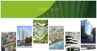
In this post, I will experiment with and research colours, palettes, and designs for my portfolio design, taking into account the context of my project and what would be easier for my client and audience to understand. For this, I will look at Ken Yeng, the executive director of Hamzah & Yeang, an architecture company known for its ecological designs.
On the front page of their website, there is a wide range of their projects. When selecting a project individually, it shows the name of the project and then a page of the general open information is opened. I liked the feature where the image holds the name of the project as well when selecting the project.
The general information is composed by the client, the location it was on, the measurement of the site area, and the year it was built, as well as some context of the building, the requirements of the client, and the features they wanted the building to have that were added to the building. The bottom explains the inspiration that took place in the design of the building in the facade and in the lobby or main entrance of the building.
This helped me understand that the page of each individual project is a brief introduction to the most important topics of the project. In my case, sustainability, comfort, and the objectives are the most important parts of my project. I will try to introduce this using my context, the client, the aim, and the objectives, as well as some of the features that were added and why they were needed in the project.


Comments
Post a Comment